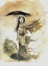

(I added a change in tone to the archway of the bridge, thank you Steve for your observation ;) )
Heres a color rough of a Humberto piece I'm doing in watercolor. Although this isn't a very complete or a full finished illustration, it was still fun. Also this was good photoshop practice for me and I thought it was time to take my concepts and put them in more of an environment. SO heres the first part of the process, I thought I would get opinions first as well, about composition, color, and tone. Let me know what you think!


16 comments:
LOVE the composition, very cool. I like the balance of complex and simple areas, very hard to do. Reminds me of Mignola, but doesn't look like his stuff-just the elegance of it. There is also a nice balance of broader shapes that you see on first glance and then it opens up a bit when you really get a good look.
hey! i think it's wonderful and i can't wait to see the finished! it has a nice light feeling to it, like he's in venice or something.
i think my only critique would be that big yellow dome. i don't mind that it's yellow, but i think the two tones on it should be switched, with the darker one on top and the brighter one on the bottom. right now that big yellow is a little too distracting from the character, it's what i look at first. plus it would fit your lighting better i think.
can't wait to see it sir!
Hey thanks for the comments. I really like your work I miss using paint and paper. I work primarily in Flash 8 these days I'm learning to use photoshop but haven't applied to anything I've done yet.
I love this! Bravo!!
Steve was right.
This looks better.
Hey, thanks for stopping by my blog. nice illustrations!! like what you got going here. Keep up the awsome work!
looking hot Cown Bread!! ;p
Fun design! Very cool!
cool stuff you got here!
clear and smart. an awesome illustration. Great!
Very nice Albert. I'm crazy about the composition and the colors. This is going to look great with your watercolors (although I like it now too) I agree on the tone of the bridge, good suggestion.
nice dude, I like the style and design :)
Great looking Blog...I will be back to check out more soon...
Thanks for stopping in over at Beers and Bears...
P
Great composition, love this ilustration!
Great design and love the colors you chose.
oh, wow, i got a shout out! i feel bad for taking this long to see it! but i'm glad i could help, it's def. has a more subdued feel to it. though it's lacking the punch that old yellow had. both are good!
:3
Post a Comment